Netflix TV App Redesign: A Bold New Look Rolling Out Soon
Big changes are coming to your living room screen! Netflix is shaking things up with a brand-new redesign of its TV app — and early previews suggest it’s all about improving how we browse and binge.
In this blog post, let’s explore what the Netflix TV App Redesign means for users, what’s changing, and why this refresh might just be the best thing since autoplay previews.
🎬 What’s New in the Netflix TV App Redesign?
“Netflix is testing a new homepage design for its TV app to make content discovery faster and more intuitive.”
— Greg Peters, Netflix Co-CEO
This revamp is currently being rolled out to users after successful testing throughout 2024. The primary goal? To simplify the browsing experience and make the content you care about front and center.
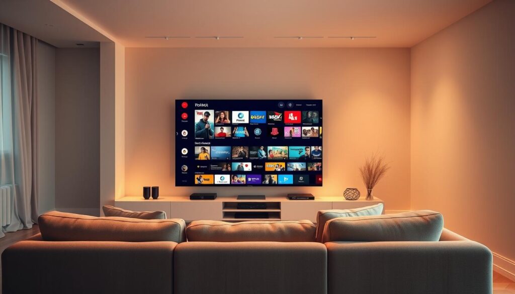
🔄 Key Design Changes You’ll Notice
Here’s a breakdown of the major improvements in the Netflix TV App Redesign:
- Enlarged Trailer Preview Window:
The trailer now plays in a bigger, more prominent space at the top of the screen — making it easier to preview shows at a glance. - Minimalist Information Display:
Information about the selected title is now cleanly shown at the bottom, reducing clutter and visual overload. - Streamlined Navigation Menu:
The traditional side menu has been replaced with a sleek top navigation bar featuring:- Search
- Home
- Shows
- Movies
- My Netflix
- Improved Remote Control Access:
Users can now press the Back button on their remote to quickly jump to the main menu — making it easier to switch categories without getting lost.
📺 Why This Netflix TV App Redesign Matters
The Netflix TV App has long been functional, but many users found it a bit clunky, especially when searching through endless rows of content. This new layout is meant to:
- ✅ Help users find shows faster
- ✅ Reduce cognitive overload
- ✅ Make previews more immersive
- ✅ Offer a more intuitive experience for new users
And with this redesign, Netflix TV App Redesign has become a trending topic among streamers and UI/UX designers alike.
📊 Comparison Table – Before vs After
| Feature | Old Design | New Design |
|---|---|---|
| Trailer Display | Small, off to the side | Large, top-center of screen |
| Show Information | Mixed across interface | Clean, bottom-aligned presentation |
| Menu Location | Left-hand vertical sidebar | Top horizontal bar |
| Remote Navigation | Multiple clicks to navigate | “Back” button opens top menu |
| Visual Experience | Busy and text-heavy | Simplified and visually focused |
🌐 Learn More
You can follow future updates and global rollouts on Netflix’s official newsroom.
🔚 Final Thoughts: A Small Change, A Big Impact
The Netflix TV App Redesign isn’t just a facelift — it’s a user-first rethinking of how we engage with content on smart TVs. Whether you’re a casual viewer or a die-hard binge-watcher, these updates aim to make your streaming journey smoother and more enjoyable.
So the next time you open Netflix on your TV, don’t be surprised by the new look — embrace it, and maybe even discover your next favorite series a little faster.
Ready to explore the new Netflix experience?
Let us know your thoughts in the comments — and don’t forget to share this post with fellow streamers!
🙋♂️ FAQs About the Netflix TV App Redesign
Q1. When will the Netflix TV App Redesign be available globally?
A: Netflix is rolling out the redesign gradually. Most users should start seeing it in the coming weeks.
Q2. Will this update come to mobile or web versions of Netflix?
A: No, this redesign is specific to the TV app experience.
Q3. Do I need to update the app manually to see the new interface?
A: Generally, the update happens automatically via your smart TV or streaming device.
Q4. Can I switch back to the old interface?
A: No, Netflix typically does not offer rollbacks for design updates once rolled out.
Q5. Will this affect my Netflix profile or recommendations?
A: Not at all! Your profiles, history, and recommendations stay the same.